

Yellow Ochre, Opera, Viridian
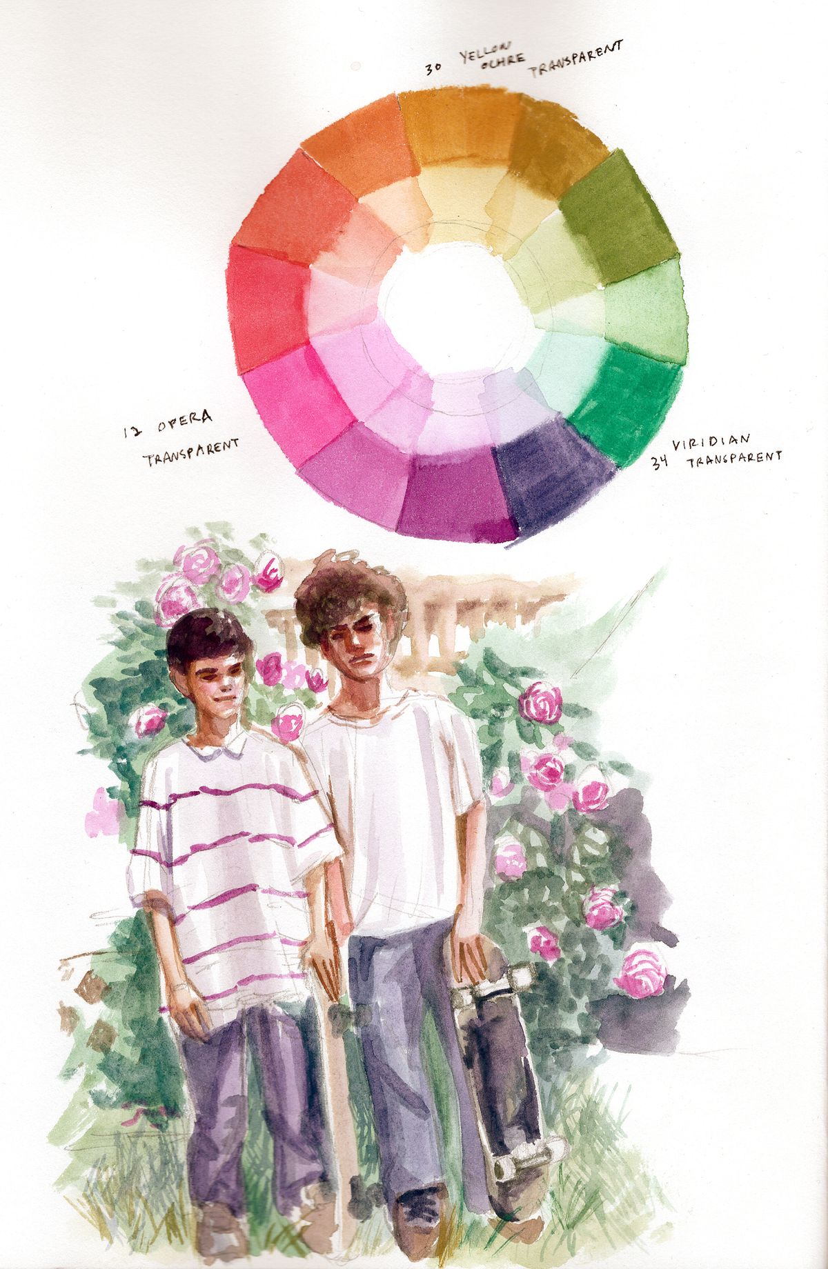
When I chose a primary triad with Yellow Ochre, Opera, and Viridian for this painting, I had a good feeling it would prove to be a fairly balanced limited palette. Nothing seemed like it would lean too far in any direction in terms of value, temperature, tinting strength, saturation or lack thereof. After putting the paint to the page and palette, I'm confident that this is a strong palette on its own. There's no blue and that was a tricky color to imply when mixing the very cool violet I used for the jeans. Either way, the range of value and hue I had did not make me miss blue all that much.
My biggest takeaway from this color wheel is this palette would most likely be a great candidate for portrait paintings. The range between purple to the pink oranges to the muted warm greens should yield an impressive variety of skin tones. There's also room for more expressive color interpretation. My reference photo provided a small preview of the palette's range. With the right painting subject, this palette could go even further.
I'd rate this palette quite high and I'm willing to use it again without modifications. The only thing I'd note is the pigment for Opera is not lightfast. It's not a dealbreaker, but has to be kept in mind.